Sailing Academy Platform
Today
Live since 2021. The platform powers the academy's public website plus the internal tools staff use every day — bookings, schedules, reminders — and a QR-based rental flow for clients.
Right now I'm rebuilding it from scratch for AI-search visibility: performance-first, fewer clicks, structured so engines surface it when people ask about watersports around the lake. See the evolution ↓
The Journey

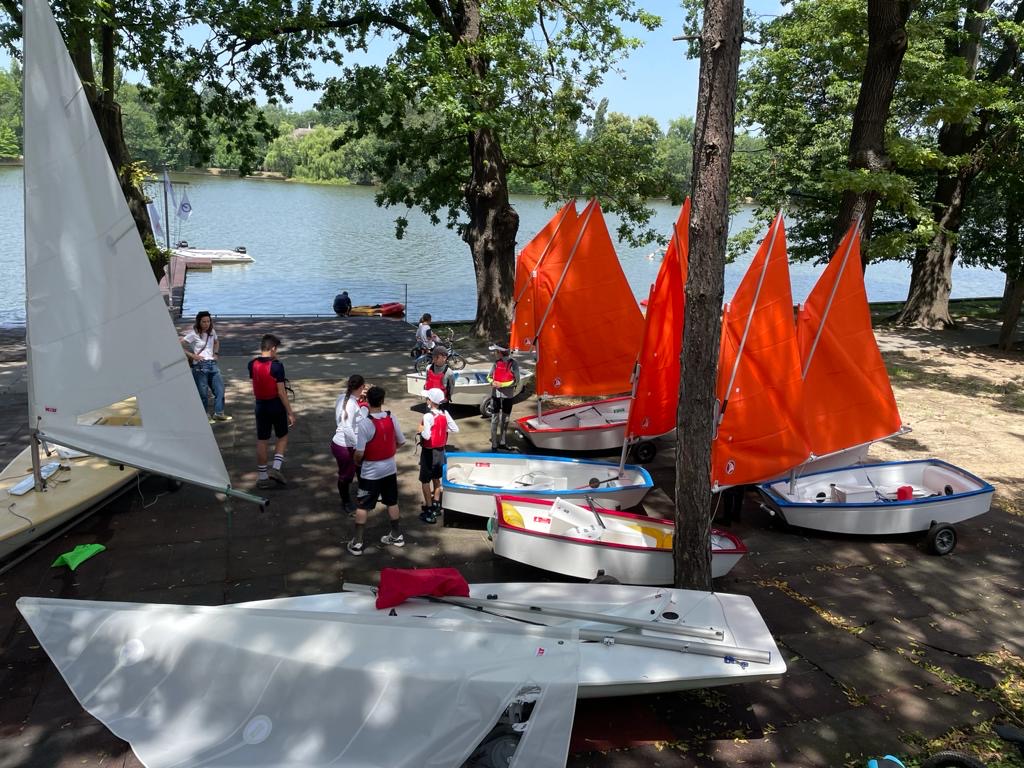
Growing up passionate about sailing, competing in numerous races throughout my youth. This deep connection to the sailing community sparked the desire to give back and help others discover the joy of being on the water.
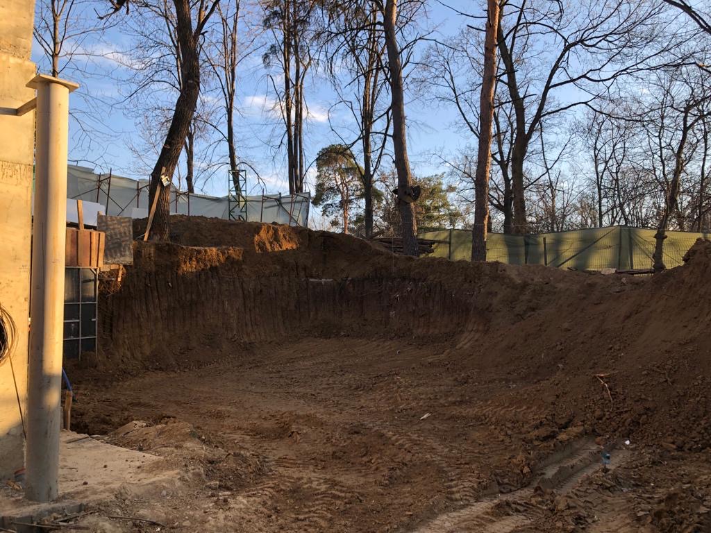
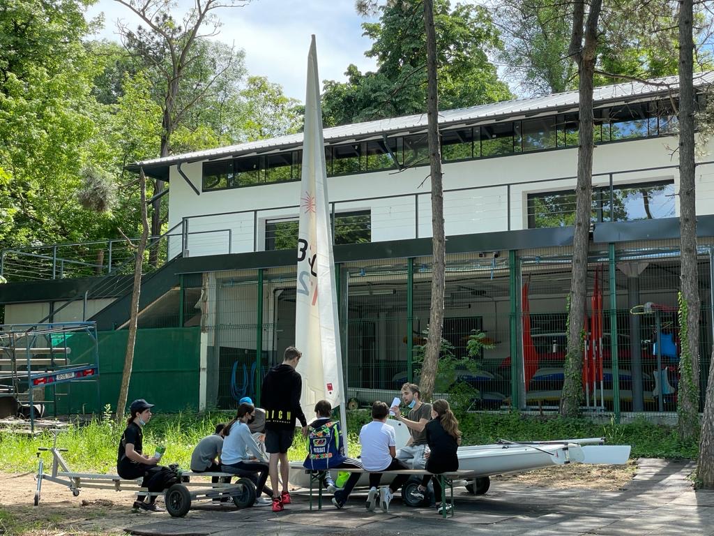
From vision to reality - constructing Sailing Academy Romania from the ground up. Transforming an empty space into a thriving sailing community hub, complete with facilities, equipment, and the foundation for future growth.
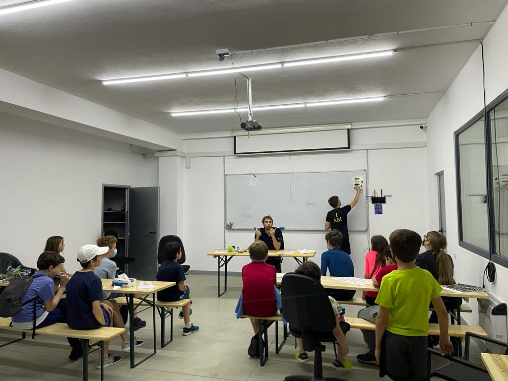
Through working with sailing students, I discovered my passion for explaining complex concepts in simple terms. People often say I'm patient and have a gift for making difficult ideas accessible. This realization shaped how I approach both sailing instruction and software development.
Built comprehensive staff management webapp, replacing the paper-and-notebook booking flow. Features scheduling, note-taking, automated reminders, and operational efficiency tools.
Revolutionary contactless boat rental system currently in development. Winter 2025: Development phase. Summer 2026: Product rollout. Clients will scan QR codes to independently access boats, enabling 24/7 operations.
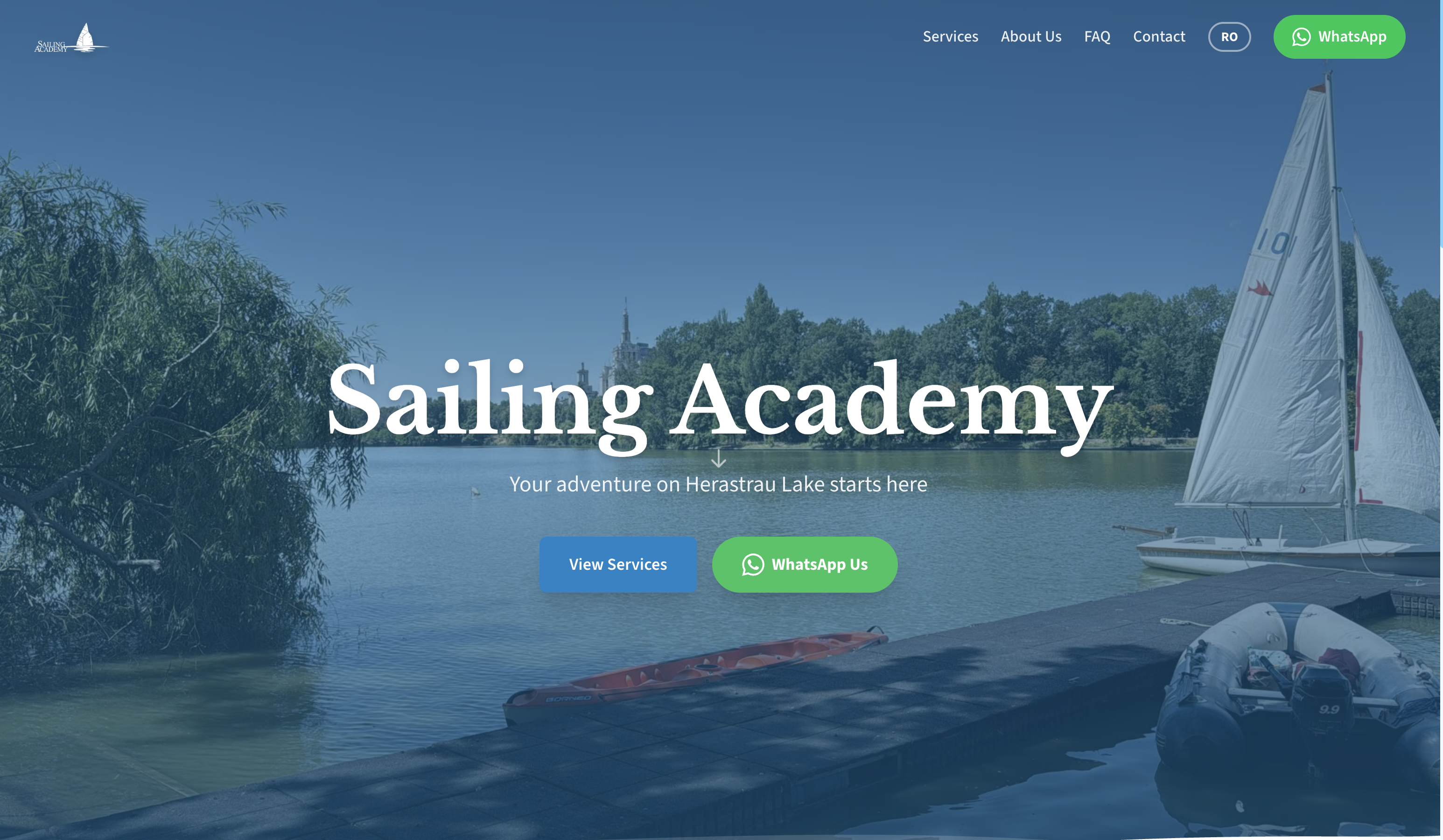
Full reimplementation focused on being discoverable by AI-powered search engines for watersport activities around the lake. Moving from a visually polished site to one that loads fast on every device and browser, is simple to navigate, and gets straight to the point — fewer clicks, faster answers.
Key Learnings & Challenges
Mobile ≠ Laptop
I finished the whole desktop design, felt good about it, then opened it on my phone to show someone — and everything was broken. Menu didn't fit, buttons stacked weirdly, half the page off-screen. That's when it clicked: you don't bolt mobile on at the end. Mobile and desktop are two designs sharing one codebase.
Observing Beats Asking
Watched staff take bookings on paper all day — names, phone numbers, times scribbled in a notebook. Then at the end of every day, one person sat down and copied everything into a shared calendar. I didn't ask "what should the app do?" — I just digitised exactly what they were already doing. Booking goes in once, lands in the calendar automatically. Asking would have given me a much bigger and worse spec.
Code Wasn't the Whole Job
The 2026 redesign is about visibility — getting the academy in front of people who'd actually book. Code alone wasn't going to do that. So I cold-reached travel and tourism bloggers, offered each one a free 2–3 hour session at the club. Most local ones — same city, easy yes — showed up, had a good time, wrote about us. Building the platform was a third of the work. Getting eyeballs on it was the rest.
Designing for Multiple User Types
Making a website feel intuitive for both clients and staff meant rethinking UX over and over.
Shifting Between Roles
I often had to think like a developer, designer, and even a staff member at the same time. Switching hats so quickly wasn't easy, but it forced me to stay pragmatic.
Making Internal Work Visible
The hardest part wasn't coding features — it was understanding the invisible workflows (lost emails, scattered notes, ad-hoc fixes) and turning them into something structured without overcomplicating things.
Design Evolution
Three generations of the site, each rebuilt for what the business needed at the time.
Basic navigation, simple layout
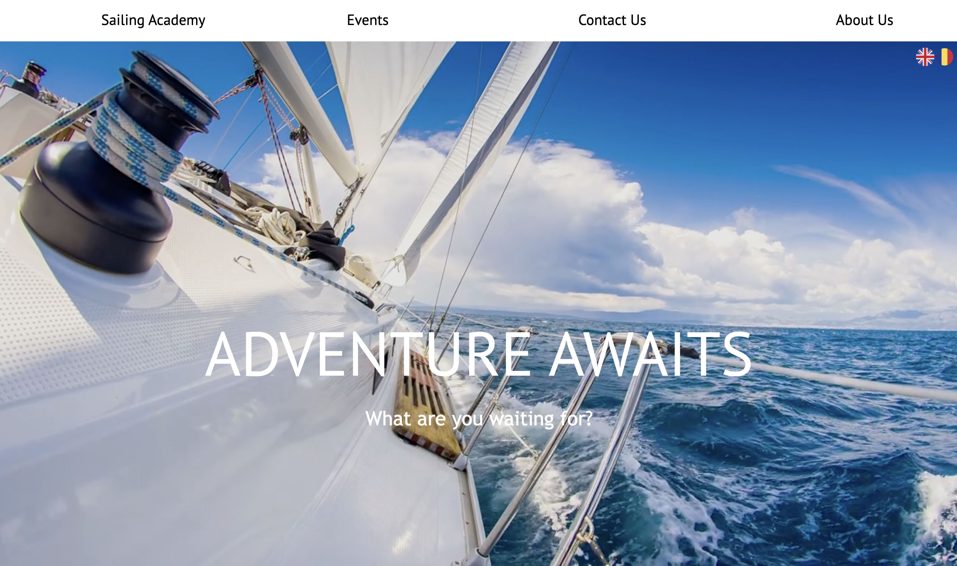
Visual polish, modern UX
Performance-first, built for AI search
Page-by-Page Comparison
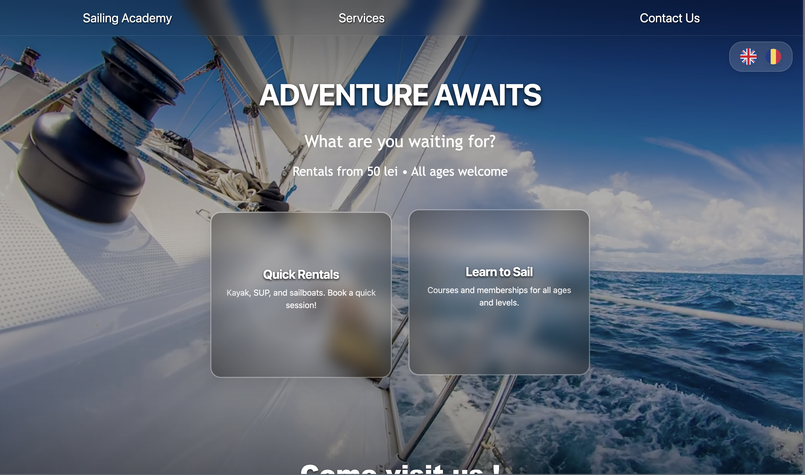
Services page
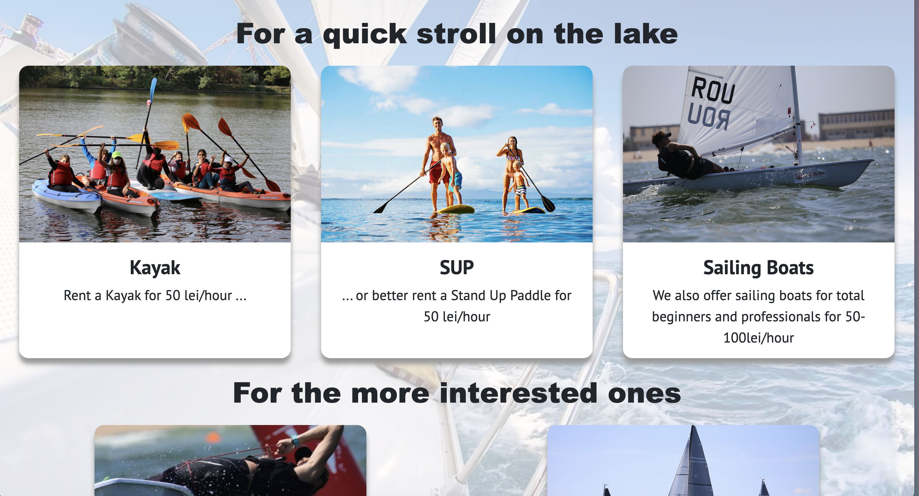
Basic services layout
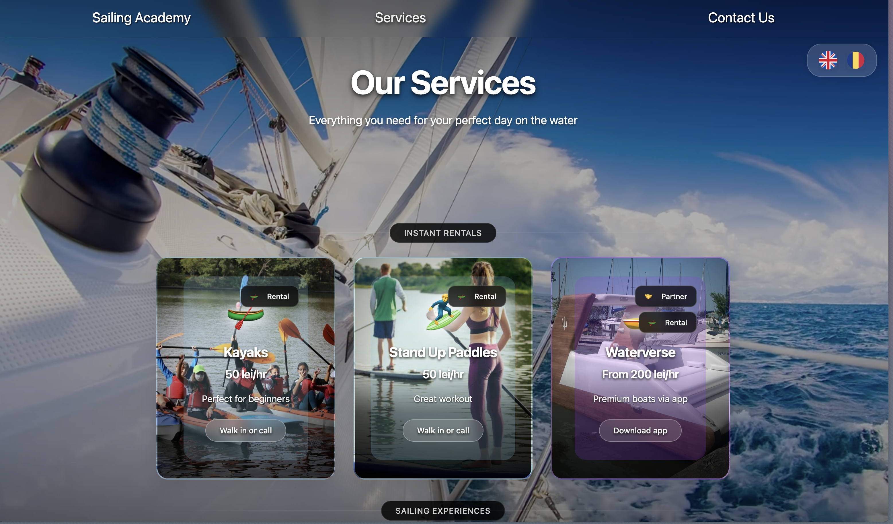
Enhanced presentation
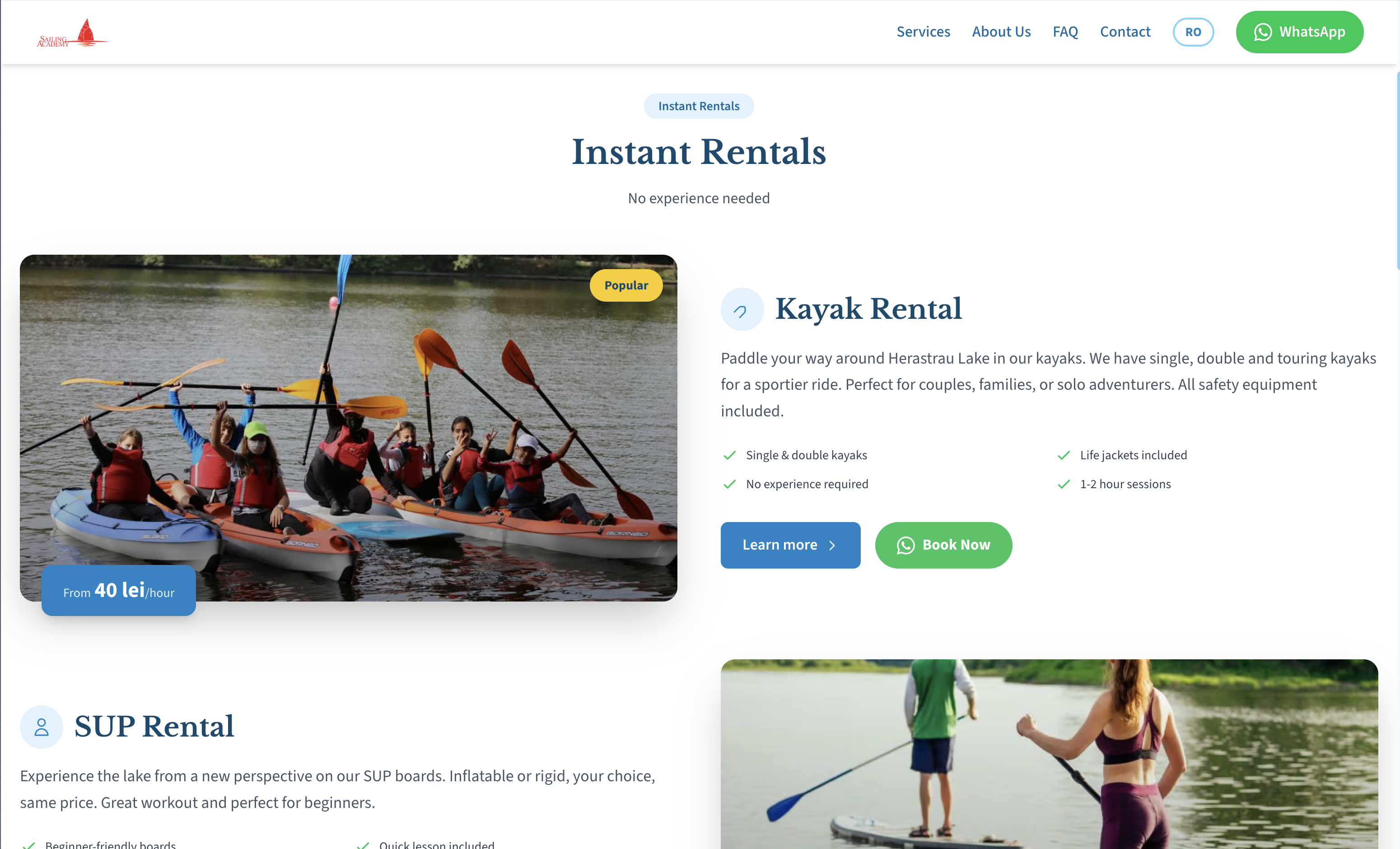
Direct, scannable, action-first
Contact / Find Us page
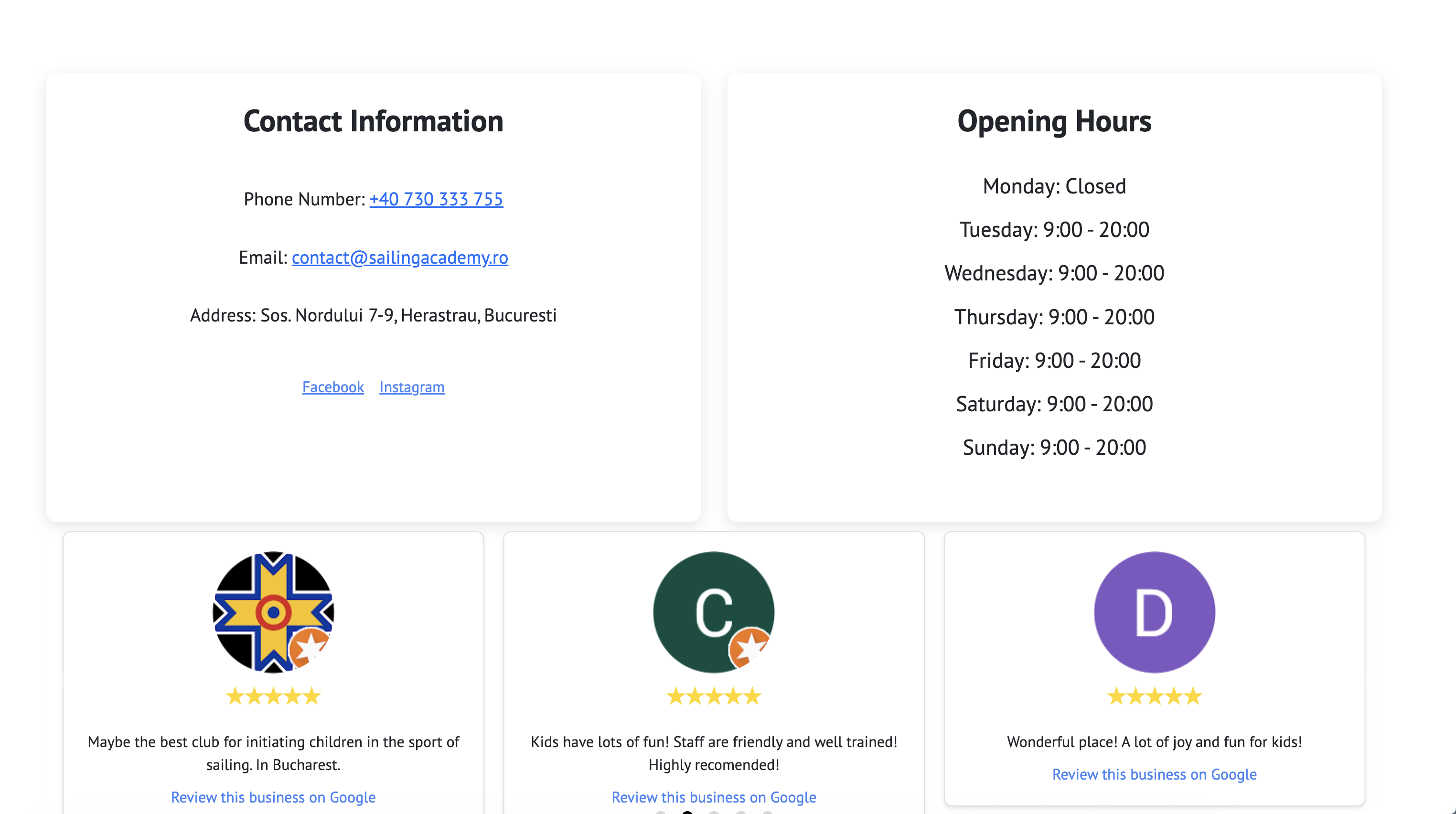
Hard to find contact info

Clearer contact and navigation
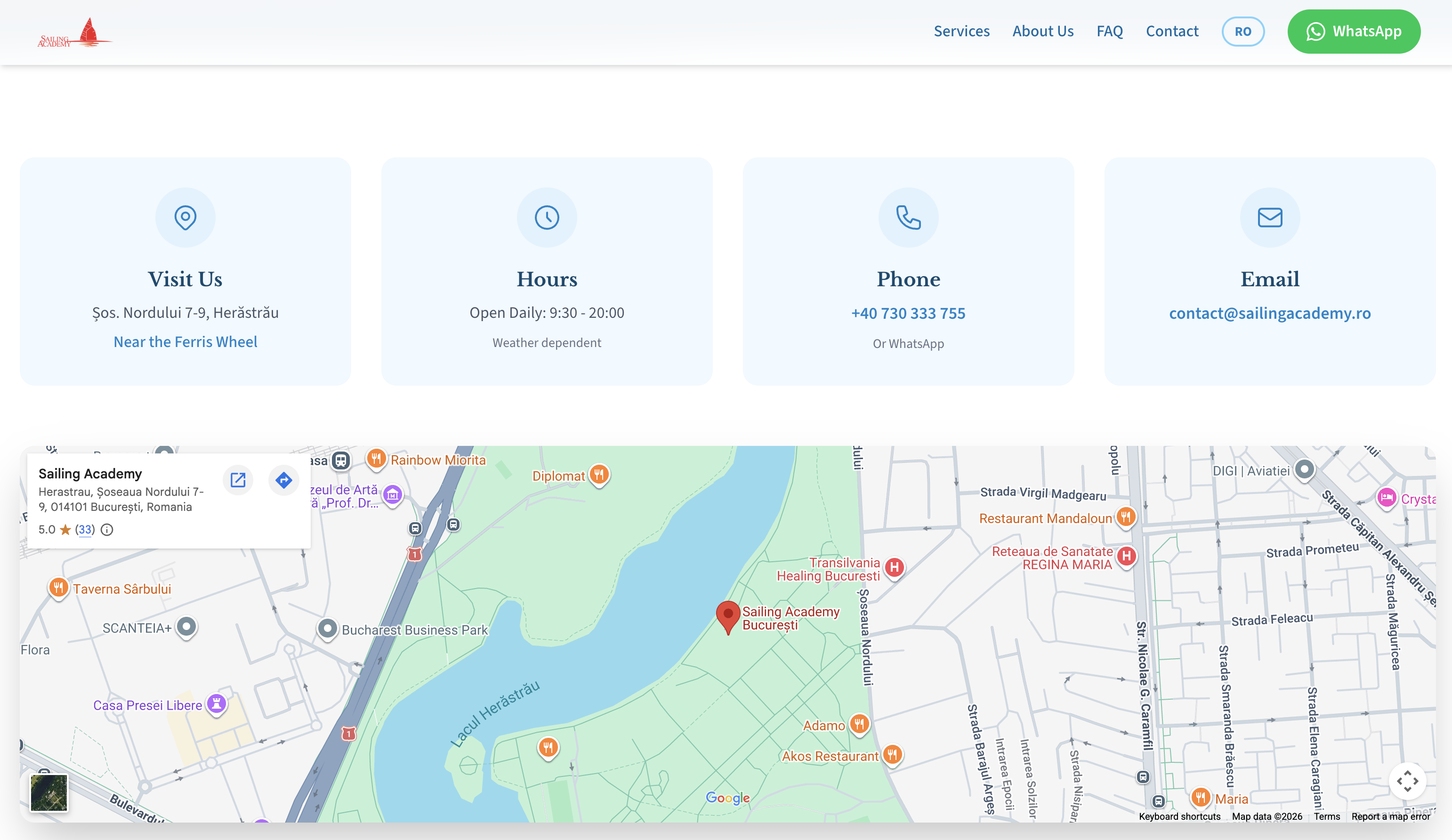
All channels at a glance, map inline
What it did for the business
- • Online presence + digital registrations
- • Replaced paper-and-notebook bookings with a real tool
- • Set up contactless rentals via QR
- • Multi-language reach (RO/EN)